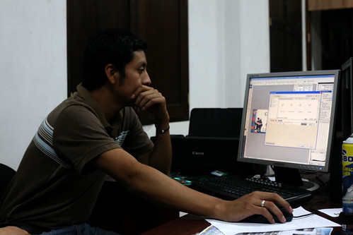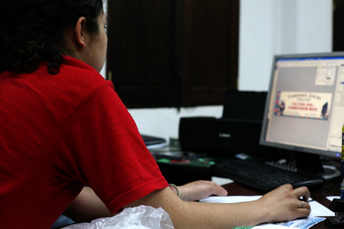
Yesterday morning, two of our Parsons students and I met with the designer for the municipality, Jeremias. He was actually hired as a computer technician, and has ended up also designing all the marketing materials for the local government and its events.
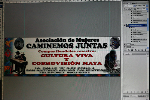
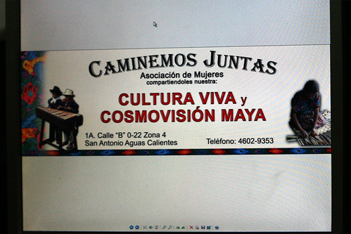
He was interested in our feedback on his design for a vinyl banner promoting a local artisan women’s association “Caminemos Juntas.”
Our students did a terrific job in taking him step-by-step through a graphic designer’s decision process, emphasizing less is more, the importance of white space, and the cardinal rule of not stretching typefaces.
BEFORE:
AFTER:
Jeremias was very happy with the end result, but was not sure if the client would be OK with removing the two oval images next to the main heading.
I’ll report back once it gets printed!